
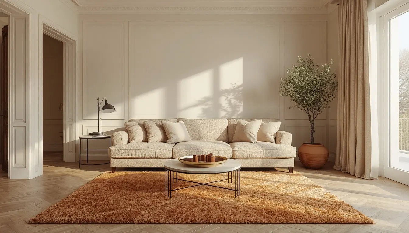
Most first-time decorators ruin a neutral space by making everything match perfectly. You paint the walls an off-white, buy a matching sofa, throw in a beige rug, and suddenly your space feels like a sterile waiting room. I get it. But skipping contrast and texture is a guaranteed way to end up with a flat, lifeless design.
This guide will walk you through exactly how to build a rich, inviting cream living room by layering colors, textures, and accents in a specific order.
We are going to treat your room like a blank canvas and add depth step-by-step—starting with the walls and finishing with the final organic touches. The actual hands-on planning takes maybe two hours, but sourcing the right pieces requires patience. Gather your swatches, take a clear photo of your empty room, and let’s get that space looking professionally designed.
Select your foundational cream wall paint.
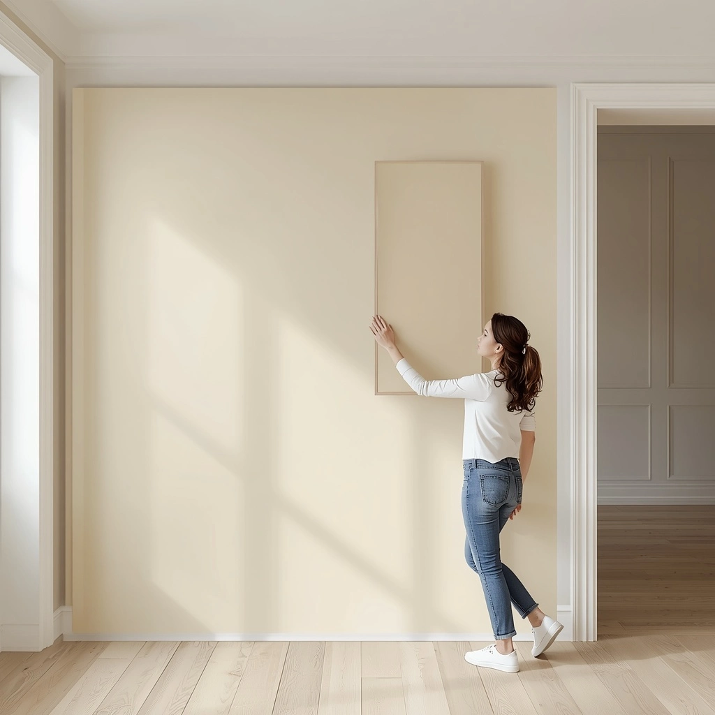
The wall color sets the stage for everything else. If you pick a cool-toned white, the room feels icy. Look for a cream that leans slightly yellow or beige, which absorbs and reflects natural light beautifully. Tape your swatches to the darkest wall in the room and observe them at 8:00 AM, noon, and 8:00 PM. Natural light drastically shifts how undertones pull throughout the day.
Anchor the floor with a warm brown or natural wood-toned rug.

The floor must be visually heavier than the walls. Do not buy a light-colored rug to match your fresh paint. A dark foundation prevents the furniture from looking like it is floating in empty space. Grab your tape measure and figure out your room dimensions.
- Unroll the rug and let it sit flat for 24 hours to relax the fibers.
- Place a thick, non-slip pad underneath to add physical weight.
- Position the rug so it leaves 18 to 24 inches of bare floor around the edges of the room.
Place your largest upholstery piece in a textured neutral.

Your sofa acts as the anchor piece. Avoid flat cotton or shiny microfiber at all costs. Choose a fabric with intense physical dimension, like bouclé, chunky linen, or ribbed corduroy. That texture casts tiny physical shadows, creating visual depth that a flat fabric lacks entirely. Position this piece so there is at least 3 feet of walking space between the back of the sofa and any major walkways.
Install heavy window treatments to soften the natural light.

Bare windows make pale walls look harsh. Frame the glass with thick fabric like velvet or lined linen to filter the sunlight and physically soften the sharp architectural corners of the room. Mount the curtain rod exactly 2 inches below the ceiling line, rather than directly above the window casing. Extend the rod 8 to 12 inches past the window frame on each side so the panels do not block the glass when pulled open.
Introduce metallic hardware for sharp visual breaks.
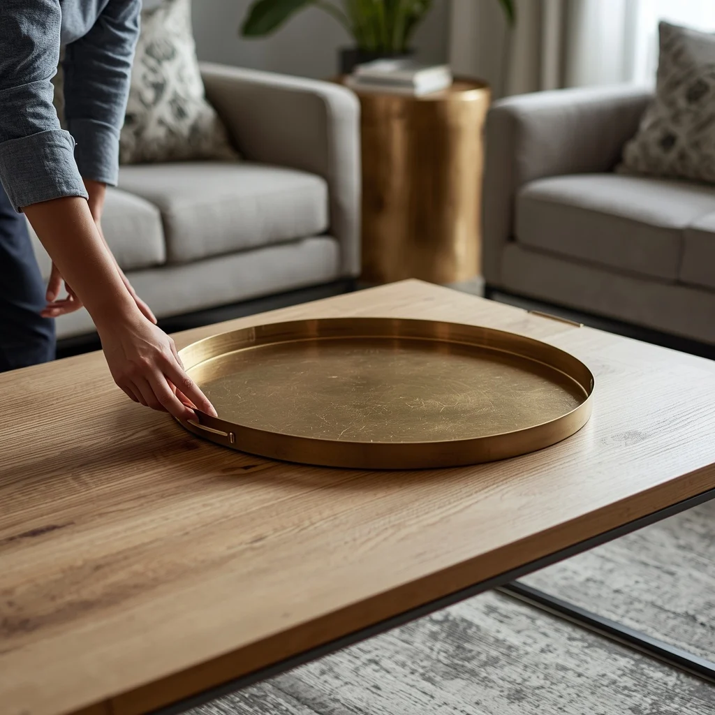
Break up the cloudy, soft aesthetic with hard lines. A room entirely composed of fabric and flat paint feels muddy. Metals provide necessary structural contrast and catch the light differently than textiles. Do this in small, deliberate doses before moving to the next layer.
- Remove any existing plastic or painted pulls from cabinets or media consoles.
- Install aged brass or matte black hardware.
- Place exactly 1 heavy metallic tray on the coffee table.
Layer soft yellow accent lighting to warm the cream base.

Overhead ceiling lights flatten wall colors instantly. Turn them off completely. Instead, rely on floor and table lamps distributed evenly around the room at eye level. Buy LED bulbs strictly rated between 2700K and 3000K. This specific temperature range casts a gentle, ambient glow that enhances the warm undertones of your cream walls without turning them orange.
Position at least three separate light sources in a triangle formation across the room so no corner falls into complete darkness at night.
Distribute dark contrasting decor to ground the airy space.

A room full of pale tones lacks definition. Give the eye resting places by placing objects in deep shades like charcoal, espresso, or matte black. Drop a heavy ceramic vase onto a bookshelf, hang a dark-framed art piece on the main wall, and set a black stone coaster on the coffee table. Group these dark accents in clusters of 3 items spread evenly across your visual plane. This deliberate contrast prevents the space from feeling like a cloud and actually makes the lighter shades pop.
Add organic greenery to breathe life into the final palette.

If you stop right here, the room will feel staged and rigid. Living elements physically soften the structured layout and introduce a complementary color that works perfectly with neutral tones. Position a large floor plant, like an olive tree, in the corner receiving the most indirect sunlight.
- Place a small, trailing pothos on a high shelf so the leaves cascade downward.
- Keep the planters neutral—matte white or unglazed terracotta.
- Water the large plant with 1 quart of water per week depending on soil dryness.
Conclusion
You just built a stunning cream living room that feels rich and intentional, rather than flat and cold. By layering textures, deep wood tones, and dark accents, you gave the space real depth. Next, start ordering fabric swatches for that perfect textured sofa so you can see them in your new lighting. Pin this guide to your favorite home decor Pinterest board so you have the steps handy when you head to the paint store!
FAQ
Why is it important to avoid a light-colored rug in a cream living room?
A light-colored rug fails to ground the space. Using a dark, warm brown or wood-toned rug provides a visually heavy foundation, preventing the furniture from looking like it is floating in empty space.
How do metallic accents improve a neutral room’s design?
Metallic hardware, such as aged brass or matte black cabinet pulls, introduces sharp visual breaks and structural contrast. This prevents a room full of soft fabrics and flat paint from feeling visually muddy.
What is the correct way to position a sofa in the living room?
The sofa acts as the anchor piece and should be positioned so that there is at least 3 feet of clear walking space between the back of the furniture and any major walkways.
Why should overhead ceiling lights be avoided in a cream room?
Overhead lighting instantly flattens wall colors. Relying on floor and table lamps in a triangle formation with 2700K–3000K LED bulbs creates a warm, ambient glow that enhances the cream undertones without making the walls look orange.