

Standing in the hardware store paint aisle looking at fifty different white swatches causes immediate decision paralysis. You know your current dark, heavy layout makes cooking feel like a chore, but painting everything stark hospital-white feels cold and sterile. The fear of choosing the wrong shade is real. Most beginners pick a warm off-white in the store, spend a week painting their doors, and realize too late that their kitchen now looks like a nicotine-stained diner.
Choosing cream kitchen cabinets over pure white softens the room and hides everyday smudges better than bright white. However, the exact tone of your cream kitchen cabinets will shift dramatically depending on the sun, your lightbulbs, and the color of your floors. You cannot pick this color from a tiny paper square.
This guide walks you through exactly how to select, prepare, and sample seven specific paint profiles so you avoid the dreaded yellowing effect. We will test these shades systematically against your existing lighting, countertops, and hardware. The entire physical sampling process takes exactly 48 hours to complete correctly, as you must watch the liquid paint cure and observe it under changing sunlight. Clear off a section of your counter, gather your sample pots, and let’s find the exact shade for your cream kitchen cabinets that brightens your home without the sterile aftermath.
Test a bright ivory for your cream kitchen cabinets to reflect low natural light.
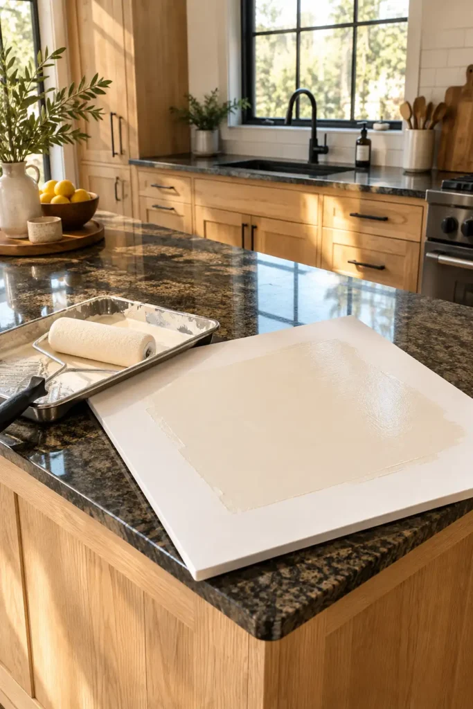
Dark interiors with small or heavily shaded windows require a paint color that acts as a mirror for whatever weak sunlight enters the room. Ivory cream contains the smallest possible drop of warm yellow undertone. This keeps the color reading as a highly reflective white without shifting into cold, blue-gray territory. Do not paint this sample directly onto your existing brown or oak cabinet door. The current dark wood will bleed through the sample visually, tricking your eye.
Instead, cut a piece of heavy foam core board to exactly 24×24 inches. Foam core stays rigid, whereas standard poster board warps and bends when wet paint hits it.
- Roll the ivory paint onto the board using a high-density foam roller.
- Leave a 2-inch unpainted white border around the edge of the board.
- Wait exactly 4 hours.
- Apply a mandatory second coat to achieve full, accurate opacity.
Brush on a yellow-based cream to warm up cold, north-facing rooms.
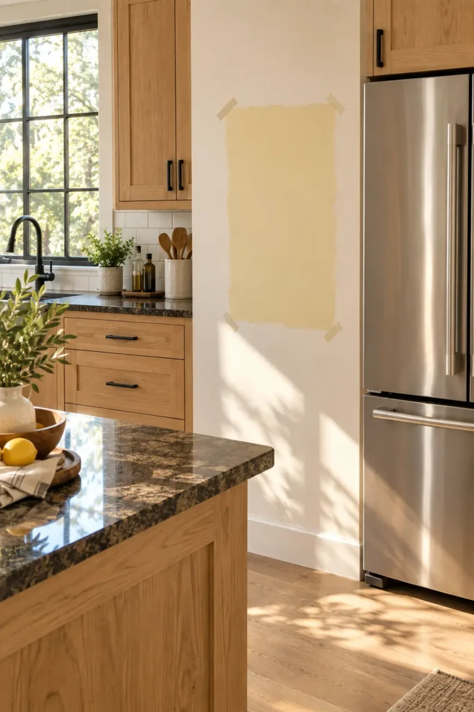
Rooms facing north pull in a distinctly blue, chilly light that makes standard bright white paint look dingy, flat, and gray. You must fight this icy natural light by selecting a cream with aggressive yellow undertones. While a heavy yellow base looks terrifying under store fluorescent lights, the blue northern light neutralizes it completely once you bring it home. Tape your prepared sample board right next to your refrigerator or a large stainless steel stove. The warmth of the heavy cream prevents the massive metal appliances from making your cooking space feel like an industrial freezer.
Sample a greige-cream hybrid to neutralize harsh afternoon glare.
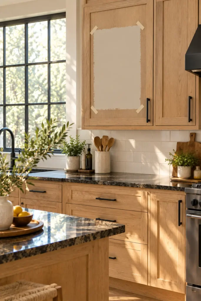
Direct western exposure bakes a room in the late afternoon. This blazing, low-angle sunlight washes out delicate paint colors and turns traditional cream kitchen cabinets into a blinding, sweaty neon hue. If your sink window faces west, you need a cream mixed with a heavy dose of gray and beige—often called “greige.” This muddy, complex undertone absorbs the aggressive afternoon glare instead of amplifying it.
Place your greige swatch directly opposite your largest window. Check the board specifically between 3:00 PM and 5:00 PM. You will notice the gray pigment mutes the harsh orange sunlight, maintaining a sophisticated, calm appearance while other brighter shades begin to look garish and blinding.
Pair earthy mushroom cream kitchen cabinets with natural wood islands.
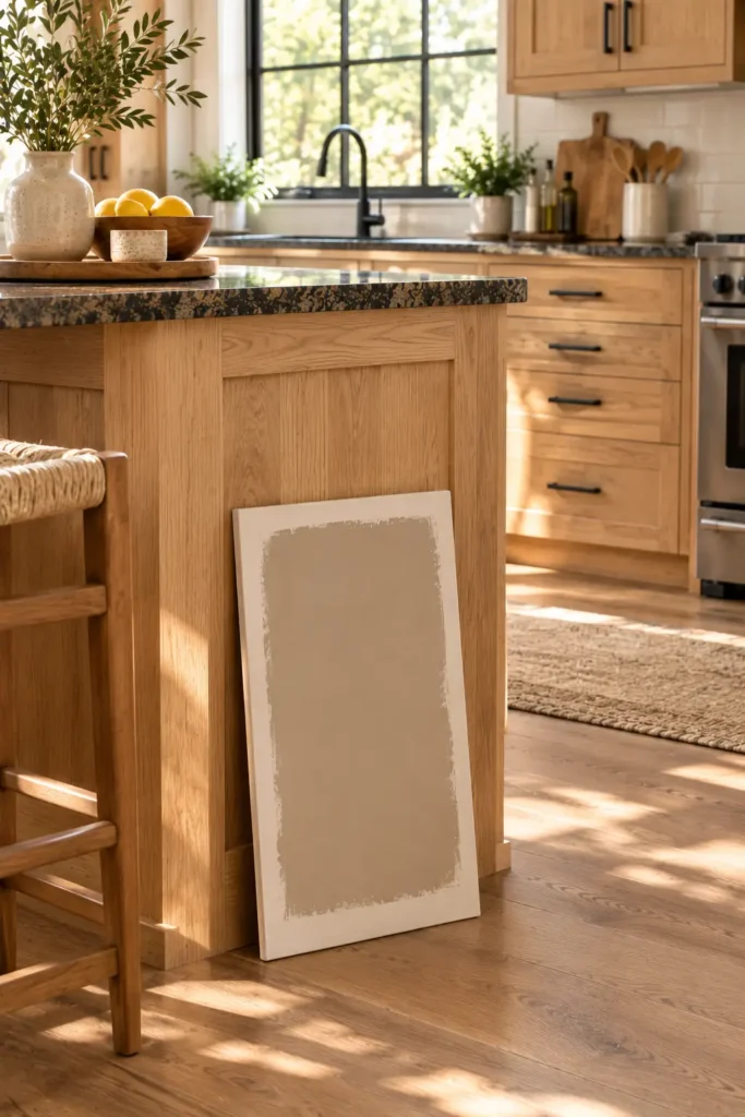
Solid wood accents like butcher block counters, exposed ceiling beams, or white oak island bases require a visual bridge between the deep timber and your upper doors. Pure white creates an aggressive, high-contrast split that makes the natural wood look cheap and unfinished. Earthy mushroom cream kitchen cabinets contain a subtle taupe-brown foundation that mimics the natural grain of raw wood.
Paint this sample directly onto a board and rest it vertically against your wood island base, touching the floor. Step back at least 6 feet. Watch the seam where the paint board meets the wood. Ensure the brown tone in the cream does not lean pink or purple next to the timber. They must share the same earthy temperature.
Apply a peach-toned cream to soften heavy, dark granite counters.
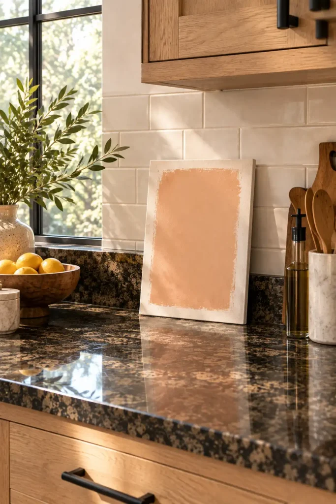
Black, dark green, or heavily speckled brown granite countertops carry immense visual weight. This dark horizontal plane often makes the entire room feel ground-heavy. Off-white shades with faint peach or apricot undertones introduce a soft, organic warmth that counteracts the cold stone surface without clashing against it. Position this specific swatch right along the countertop seam, leaning it against the backsplash tile.
If you push yellow-based cream kitchen cabinets against dark granite, the black flecks in the stone will make the yellow look dirty. The peach undertone prevents this muddy reaction, keeping the upper half of the room feeling light and detached from the heavy stone below.
Contrast pale cream kitchen cabinets with matte black hardware.
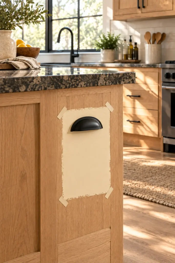
Light buttercream offers a rich, vintage cottage feel. However, if you finish buttercream doors with polished brass or brushed nickel hardware, the entire room easily slips into an outdated 1990s aesthetic. You must ground the airy, golden shade by introducing severe, dark accents.
Do not try to guess how this looks in your head. Take a physical piece of hardware—like a matte black cup pull or a bar handle—and tape it directly onto your dried buttercream swatch using a rolled piece of painter’s tape. The bold, dark metal contrast breaks up the large expanse of soft paint, giving your new cream kitchen cabinets a tailored edge that feels sharp, modern, and highly intentional.
Evaluate your painted cabinet swatches at three different times of day.
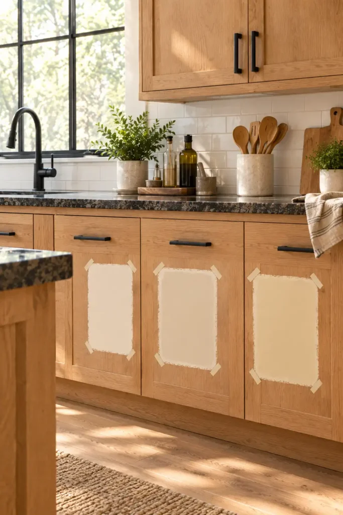
Liquid paint in the can looks completely different than dried paint on a vertical surface. Furthermore, dried paint changes drastically as the sun moves across your specific property line. A cream that looks perfectly neutral while you drink your morning coffee might turn heavily yellow while you cook dinner. You must leave all seven of your poster board swatches taped to the cabinets for a full 48 hours.
Walk into the room and take notes at these specific intervals:
- Observe them at 8:00 AM using only fresh, indirect morning sunlight.
- Check them at 2:00 PM under bright, direct afternoon glare.
- Review them at 8:00 PM using strictly your artificial overhead and under-cabinet lighting.
If a shade looks dirty, pink, or overly yellow during any of these three specific checks, cross it off your list immediately. Do not compromise.
Important Tip: Stop Painting Your Doors!
Never paint a test swatch directly onto your existing oak or brown cabinets. The dark wood will bleed through visually and trick your eye. Always use a rigid 24×24 inch foam core board instead of flimsy poster board that warps when wet.
Conclusion
You successfully narrowed down the exact right paint undertone for your specific lighting environment. Testing these variations physically guarantees your new cream kitchen cabinets will look warm and sophisticated rather than cheap and yellowed. The stressful part of picking the color is officially done. Now, gather your supplies and start wiping down your existing doors with a heavy-duty degreaser so your tinted primer has a completely clean surface to grip. Pin this guide to your kitchen renovation board so you have the testing schedule handy when you head to the paint store!
FAQs
What paint finish should I use for cream kitchen cabinets?
Always use a satin or semi-gloss finish. Cream paint needs a slight sheen to reflect light and resist food stains. Flat or matte finishes absorb grease and become impossible to wipe clean without scrubbing off the actual paint.
Do cream cabinets look good with stainless steel appliances?
Yes, but you must choose a cream with a distinctly warm undertone. The warm paint balances the cold, icy look of the stainless steel, preventing your kitchen from feeling like a sterile commercial prep room.
How do I stop my cream cabinets from turning yellow over time?
Use a high-quality water-based enamel paint rather than an oil-based one. Oil-based paints naturally amber and yellow as they age, especially in shadowy areas that do not get direct sunlight.